I think the best time of the weekend is driving home from work on Friday evening and thinking of all the potential of the weekend. Time to draw, paint, hang with family and friends and thank God for blessings.
This is an ATC-sized (3 1/2” x 2 1/2”) watercolor. I’m practicing bolder strokes with heavier pigment. Big departure from my usual uber careful strokes
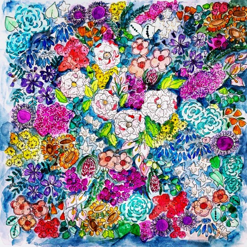
"Beauty of Hope" as one of the original painting I donated to charity and it was auction in exhibit. It was one of my favorite painting so far.
I used koi watercolor and a fabriano 200 gsm paper. Most of the color I used are blue, green, light green and yellow and a bit of orange. The metallic gold paint was one of the color that added flavor to the painting.
Trees in a reflection have always been a subject of interest to me. I have created several of this version, trying to fine-tune my skills and explore some opaque techniques.
had to paint light through trees in watercolor. The pattern on the chair was a pain in the butt, but I think it came out ok. Winsor & Newton professional watercolors on Blick premier cold press 140lb watercolor block. This is the first time I've used Blick Watercolor paper. It held up well, but the painting came out kind of light (not sure if the paper had anything to do with that, though). At any rate, I bought a bunch of it, so I guess that's what I'm using!
This is a work in progress, as I'll be adding more spots to my neighborhood map. You can also view the map with interactivity on my site: https://www.colorsnack.com/the-cedars-neighborhood-map/