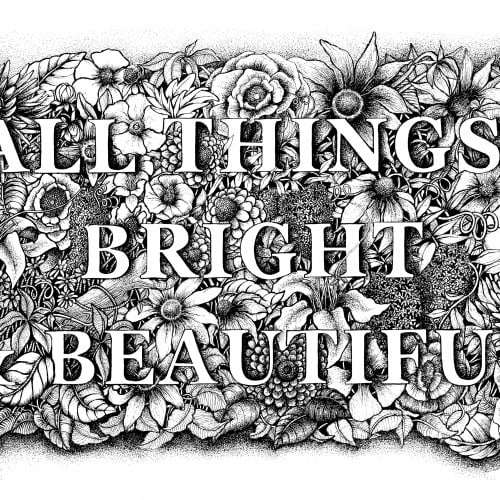
A floral botanical illustration around the words of the famous poem and hymn by Cecil Alexander "All Things Bright & Beautiful'. Drawn in pen & ink with another on the way...'All creatures great & small.
More ballpoint pen experiments. This was trying to "blend" colors, using ball point pens in a similar way to colored pencils. I found Layering evenly to be pretty difficult, esp with the pens blotching and very very limited burnishing. The interesting thing is that the paper doesn't seem to get "tired" the way it does with pencils. This is just cheap printer card stock.
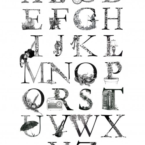
My Illustrated Alphabet letters were born out of a project in 2016. Each was drawn with pen & ink and each letter is illustrated with either an object, flora, fauna or wildlife that begins with that letter.
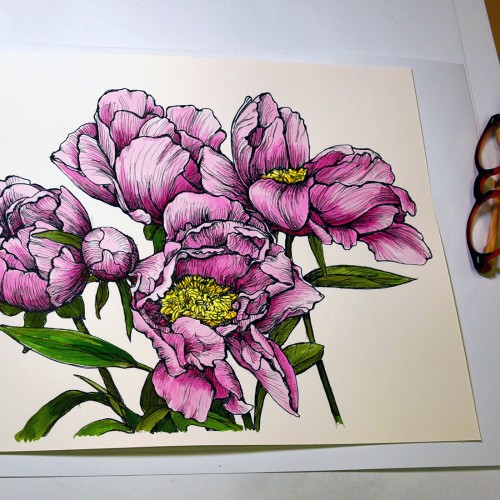
This started as a line drawing based on a photo of peonies in the garden. It’s drawn with three different pens: Micron 005, Micron 03 and Faber Castell Pitt superfine (0.3) on 11x14 Strathmore Bristol Vellum. The paper isn’t terribly tolerant of wet media, so I played around with tinting it in Photoshop because I wasn't sure how it would go. But I liked it in color enough to chance painting the drawing with the nice and bright Dr Ph Martin Hydrus watercolors. It's photographed it on my drafting table with my glasses for scale. The lamp has a daylight bulb, so I think the color (at least where the light is more prominent) is fairly true.
Drawn from a garden photograph. This took me much longer than expected. I kept stopping because I was getting discouraged. I still don't like the leaves, but there's not too much I can do about it at this point.
What's more comforting than a summer day with butterflies flitting and bumblebees tumbling amonst the flowers in the meadow? My husband felt that blue was most comforting for him. Me, I liked the salmon. The mandala is drawn in Spirality...which takes the designated "wedge" and repeats it around the circle. Colored in Photoshop (given there is a 20 min. time given for this challenge---otherwise, I would have colored it by hand).
This started as a pen line drawing (with Skura Pigma micron pen) which I then painted with Dr PH Martin's Hydrus watercolors. They are fun and very bright. This is on Strathmore 300 11x17 Bristol paper.
Poppies are among my favorite flowers---vibrant AND delicate. Great swaths of "bread poppies" garnish our garden. We harvest seeds for lemon-seed cake and poppy-seed rolls. (No, we don't harvest that other stuff.) They reseed generously and we have beautiful crops of red and purple flowers each year. I've been working on this colored pencil drawing for the past week. Enclosed are some images of the progress over that time.
My Vintage blue floral pattern print was designed for fabric. Originally drawn in black & white line, the blue adds a vintage feel and reminds me of the blue and white china of yester year.
Sensuality, power and fertility - meditative layers and tangles of flowers, weeds, and grasses. A bee emerges, free! Ultimately a positive message of hope!
Oh boy, markers (NOT a go-to), least favorite color, and a subject that isn’t on my radar. This was a hard one what with 3 negatives going for it. But, hey, it’s a challenge, right?
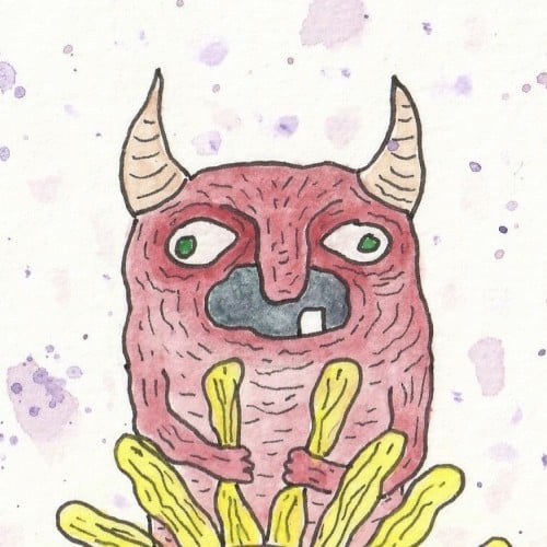
Choosing a subject came first….we have a house full of Indonesian masks and sculptures. (My husband studied gamelon music in Indonesia.) Garuda, the “mount” of Vishnu and popular with Balinese artists seemed a good choice, esp. since he can be green, red, yellow or orange.
I rarely choose yellow/orange for anything---artwork, décor, clothing...though I do have a soft spot for sunflowers.
First I drew a bunch of images based on one of our wooden Garuda sculptures and then made a simplified marking pen outline and colored it with markers.